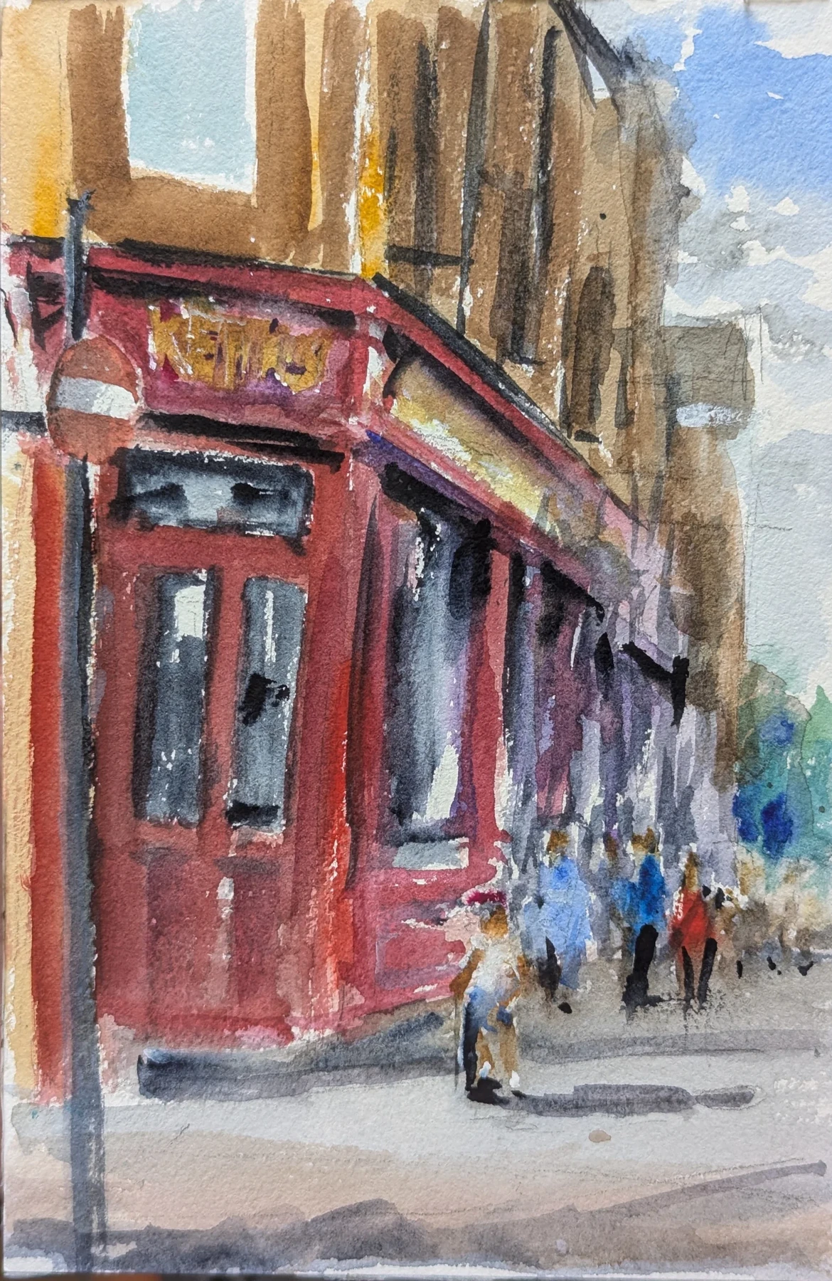
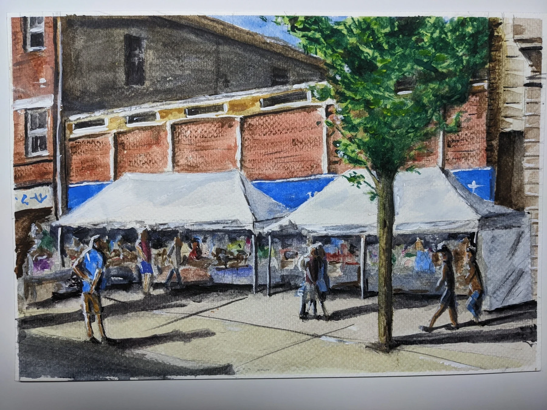
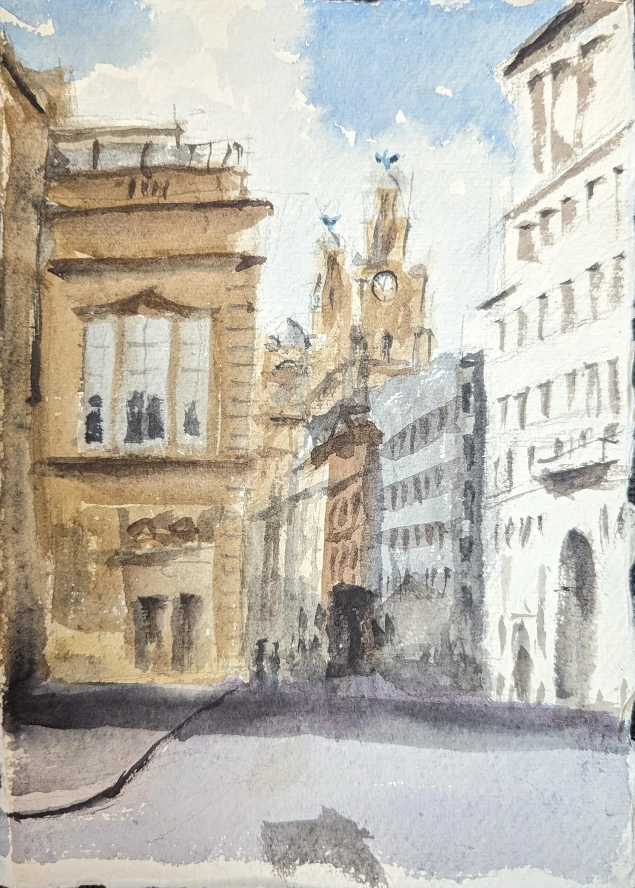
A contour is a selection
A wall has texture, a shadow has a boundary and a roof has an edge against the sky. They do not all need the same kind of line. Use the clearest contour where it helps the subject read. Let a pale surface fade into the paper when the neighbouring marks already describe it. Leaving a gap is an active decision, not evidence that the pen ran out.
Give overlap a stronger voice
Where one object sits in front of another, a firmer mark can explain the separation. Under an awning, a short dark line can describe depth. On a sunlit wall, a broken, lighter line may be enough. If your pen makes only one width, vary how much line you use: continuous in one place, interrupted in another, with small clustered marks where you want attention.
Avoid going round every edge twice to make it “confident”. Confidence is often a matter of choosing, then leaving the mark alone. A second line is useful when it explains a changed position; otherwise it can make the whole drawing look woolly.
Hatching belongs to a shape
Before hatching a shadow, decide its boundary. Lay the strokes in a consistent family and keep the light areas open. A second direction can deepen a small accent. Covering every surface with the same nervous knitting removes the very contrast you meant to create. Step back and ask whether the dark is describing a plane or simply recording the amount of time you spent there.
Your turn · 20 minutes
Take it to the page.
- Draw a familiar doorway once with an unbroken contour.
- Draw it again with gaps on the light side and firmer marks at overlaps.
- Add hatching to one shadow only; compare both drawings at arm’s length.
Look back: Where does your eye stop first? Which missing line can the viewer comfortably supply?
Sources & further looking
Close-looking observations and practical exercises are this publication’s interpretation. Illustration credits are shown beside each work.